I’m an artist and printmaker based in Reading. I cut maps of cities into linoleum by hand. The largest of them took two years to make, five months of that spent carving. Almost everything I do takes a long time, which is the part I like.
The first thing I ever cut into lino was a sunflower, at Reading College, taught by the illustrator Peter Hay. The maps came not long afterwards. I’d just got back from two months of travelling that ended with a week in New York, where I’d photographed street signs and road signs without any particular plan for them. Then I saw the brief for the ISTD competition — the theme was Where in the World — and Owen Andrews, the technician in the printmaking room, let me have a large sheet of lino. What I kept coming back to was standing in Times Square with signs facing every direction at once. That’s where the maps come from: type that doesn’t sit politely in rows and isn’t always the right way up.
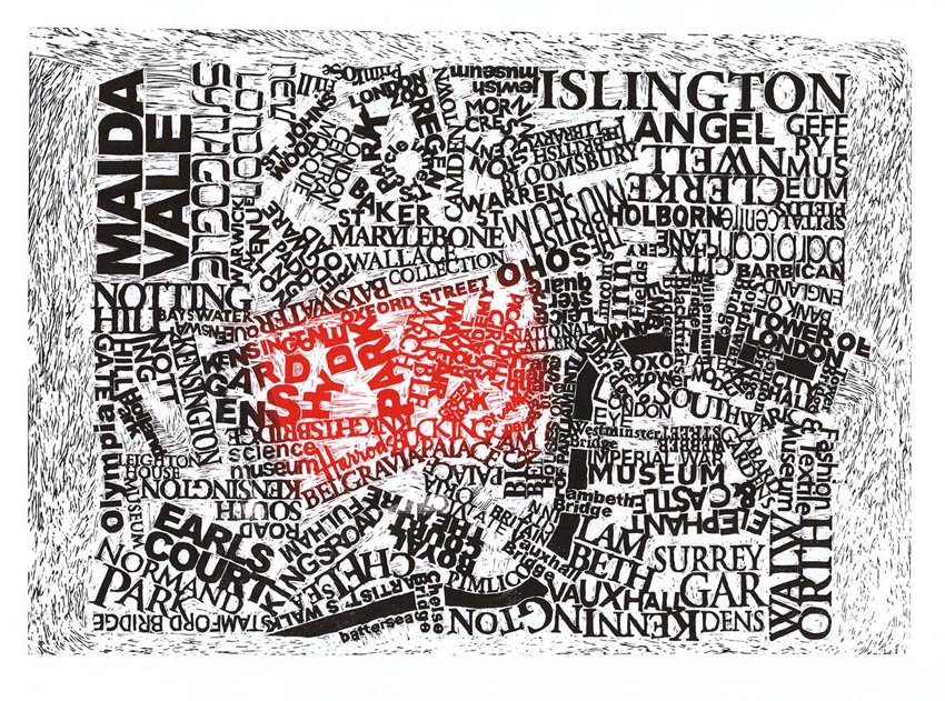
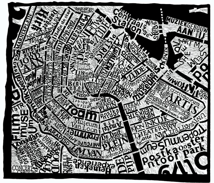
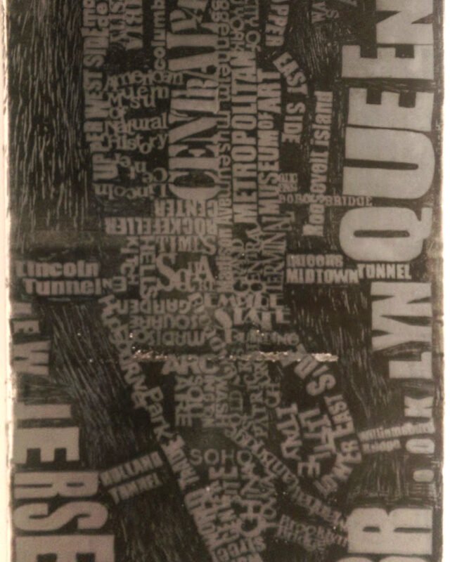
Each map holds on to the things people would notice if I got them wrong. The outline of Manhattan is accurate, and so is Central Park. Rivers and canals are left solid black — letters never worked there in any of the sketches, and everyone already knows the shape of the Thames, so it gives the map something to be. The main roads are cut away as empty channels with texture worked into them, and the type sits in the blocks between, roughly where those places actually are.
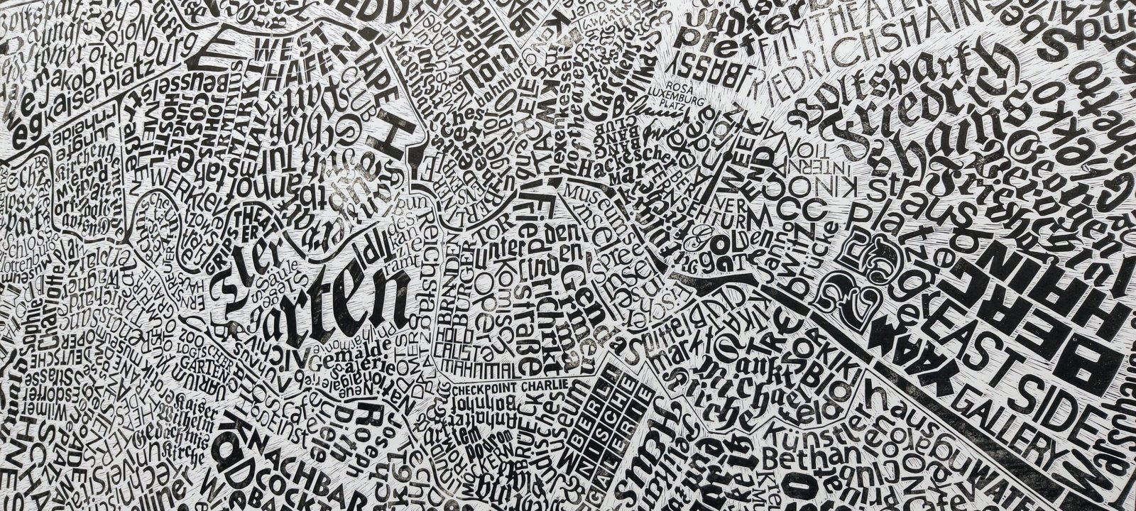
The words can be anything with meaning to a place: road names, area names, landmarks, things people have told me when I’ve asked. Some of it is personal. John’s Cosy Jungle Hostel is on the Berlin map because I stayed there for a month. At exhibitions people tend to find their own street, or a bar they used to drink in, and that’s usually the first thing they point at.
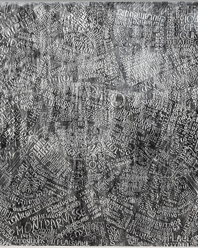
New York came first, then London. The two were entered together as a pair and won a Silver Cube from the Art Directors Club of New York, which is what turned the idea into a body of work rather than a one-off. Amsterdam followed, then Paris, then Berlin.
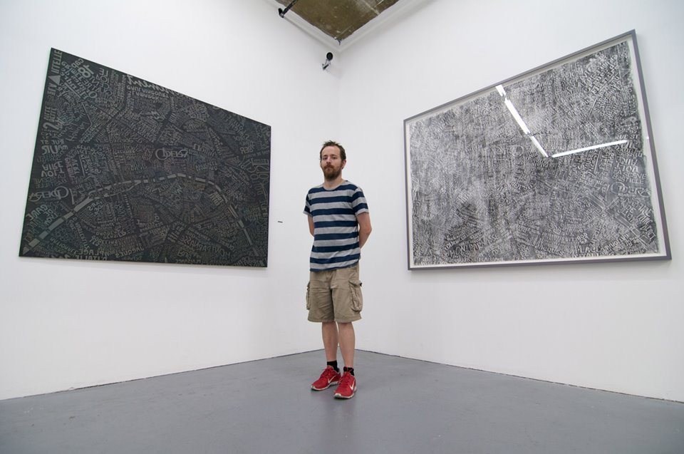
The Berlin block is 3.4 by 1.74 metres, cut from the largest sheet of lino I could get hold of. The print for sale was trimmed down to 1.74 × 2.2m. I spent two months in the city first, photographing and researching. The background is carved so that the marks converge on the Fernsehturm — you can see the tower from most of Berlin, and it seemed right that the map should do the same thing.
It was carved at Jelly, in their space in Market Place, where I was artist in residence for two and a half years. There were other artists in the building and members of the public came through and looked, but I worked from early morning until late and was mostly alone with it. The room was cold. I set a camera on a tripod and photographed the whole carve, and in the timelapse you can watch the heater arrive, then the gloves, then the sleeping bag. Five months compressed into a few minutes: watch the Berlin timelapse. I ran my life drawing group in the same room afterwards, with the finished block in it.
It’s an awkward object to own. Lino can’t be rolled; it cracked the first time I moved it, and it’s been mounted on wood ever since. Printing takes about five hours of rolling out ink to get even coverage, then a full day of rubbing the back of the paper by hand, working to a grid so I can keep track of what’s been done. After the first print the whole block goes black and you can no longer read the ink by its shine, so it comes down to method. The edition is twelve, but every print is different. Some come out patchy and I’ve grown to like those — they look like cloud passing over the city. One came out completely solid, and that one was bought by Erik Spiekermann, who lives in Berlin.
Five hundred people came to the opening of that show, and a lot of them ended up on their hands and knees helping to pull a print. One square of the grid got ticked without being done, and you can still see it. That seems about right for something too big for one person to print alone.
Once an edition is finished I sometimes go back to the block and make monoprints from it. It’s the loosest thing I do — different grounds, different mediums worked into the lino to see whether they’ll print at all, ghost prints pulled from what’s left behind. I make the decisions on the spot and much of it doesn’t work, which is the appeal after months of carving to a plan. I’d rather not say exactly how any particular one was made, because I want to try it again on another map. Most of these experiments damage the block, so the edition always comes first. I keep the monoprints and they’ve sold out of exhibitions, though I’ve never got round to photographing them properly. They haven’t changed how I carve or print the maps; they just run alongside them.
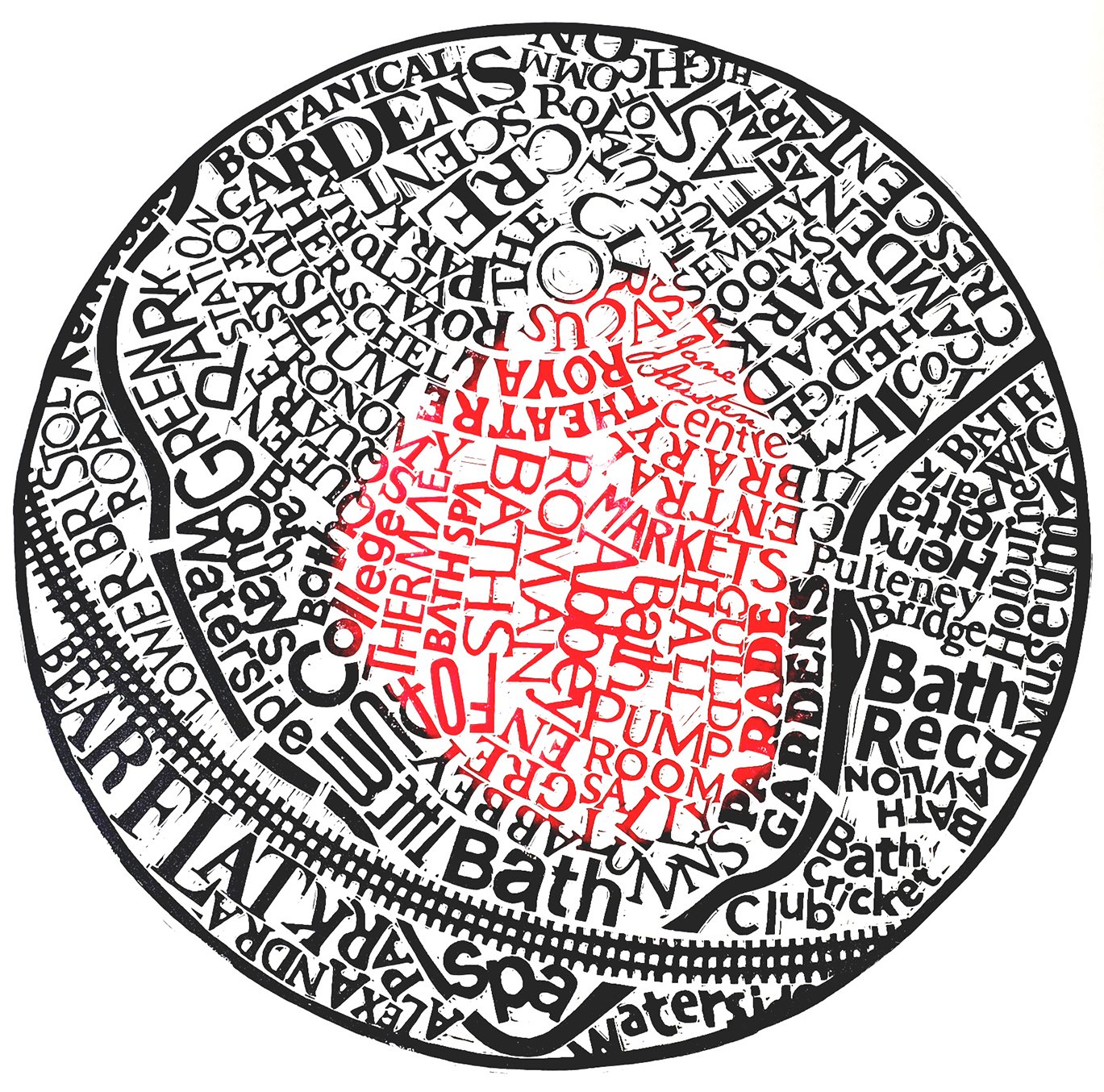
For a few years I had no studio, which changed what I could make. The Bath map came out of that — a 40cm circle, chosen because people kept telling me the city sits in a bowl. Working smaller meant simplifying, and it worked. I later pressed the block into clay and made an actual bowl from it, which damaged the lino, so that edition won’t be finished.
In 2009, just after finishing the Paris map, I was invited into a show called The Art of Lost Words, where each artist was given an obscure word and asked to make work about its meaning. Mine was dehisce — to split open along a seam, as a seed pod does. I made an animation of it, a seamless loop that runs about twenty-five seconds. It took 297 drawings, transferred onto 297 hand-cut squares of lino and carved. I scanned every block before printing it, printed each one once, trimmed all the prints down so they looked like polaroids, and scanned those too — so there are two versions of the film, one made from the raw carvings and one from the prints. Aligning the first of them took two days in Photoshop. Then I left ink sitting on the blocks overnight and it dried, and a lot of them were ruined. The piece was shown at the International Print Center New York in 2015.
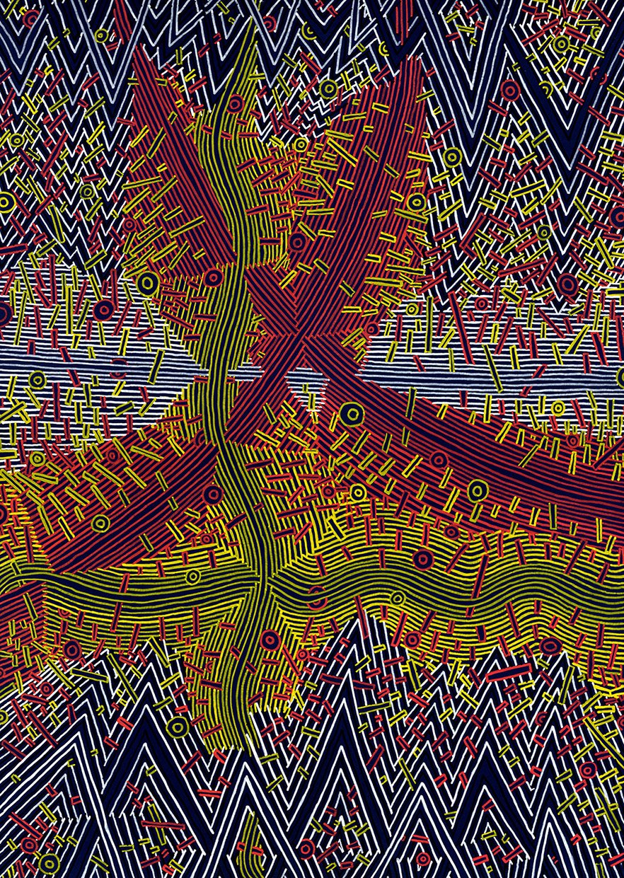
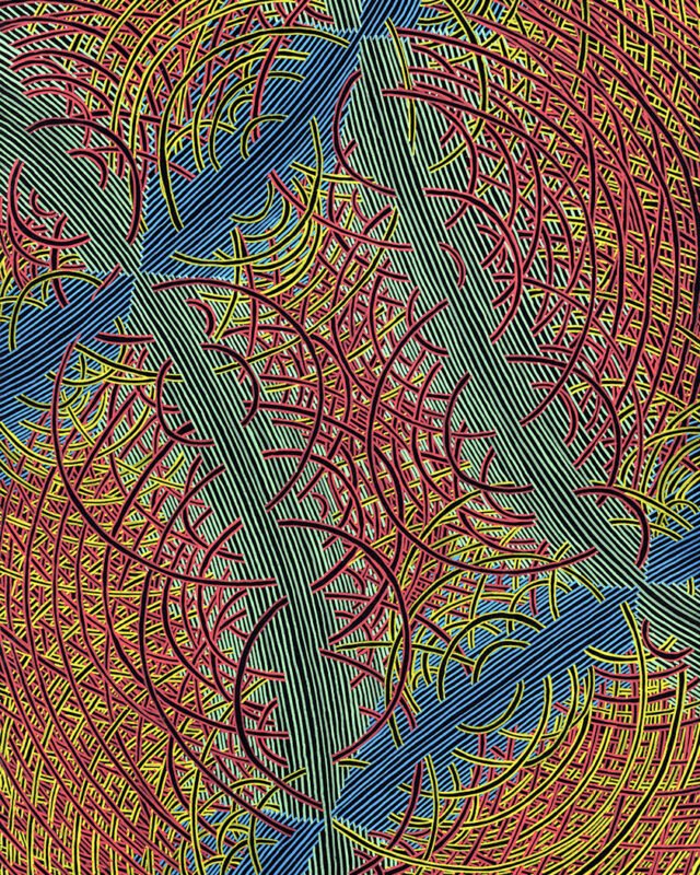
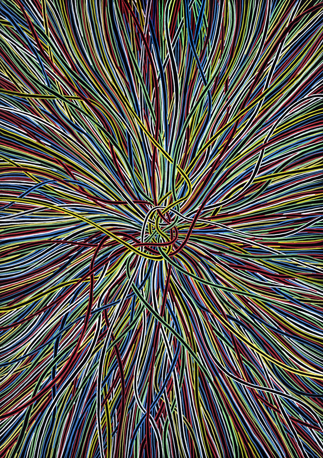
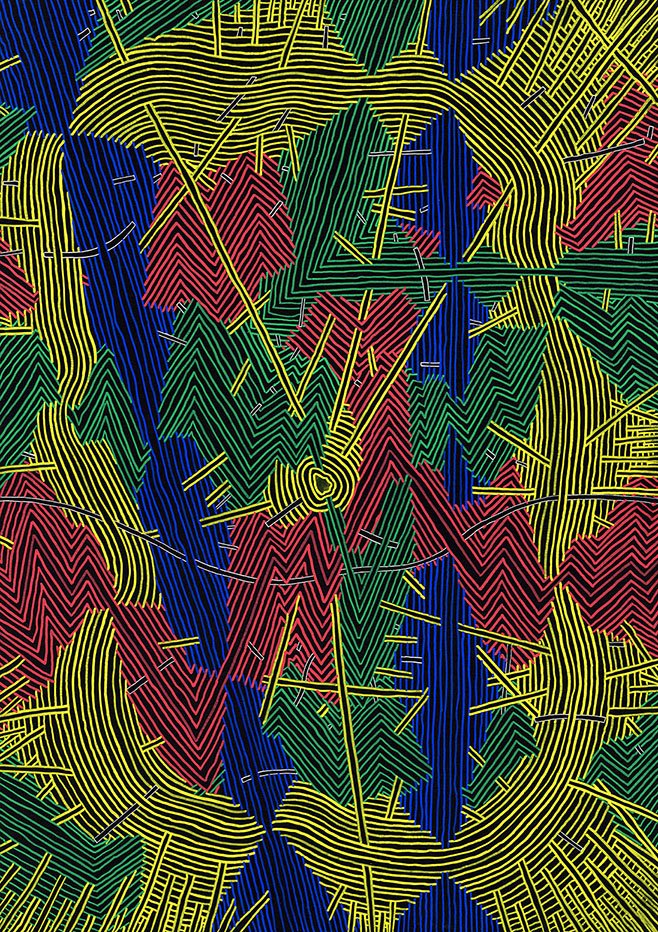
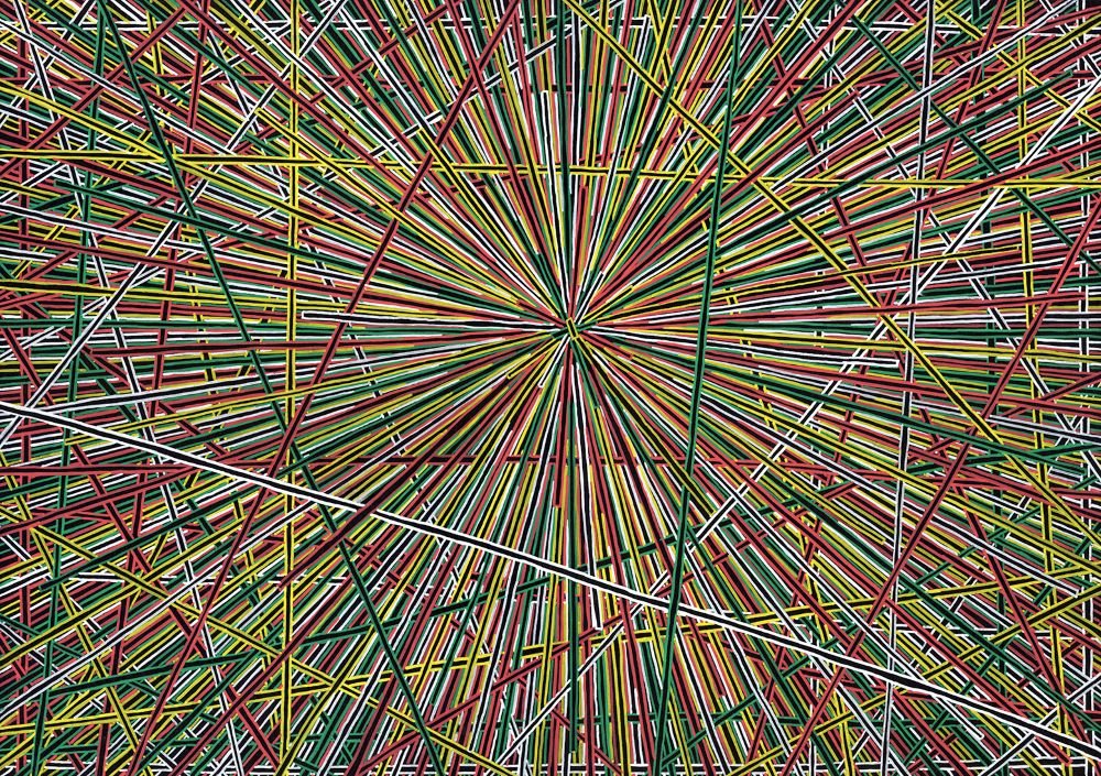
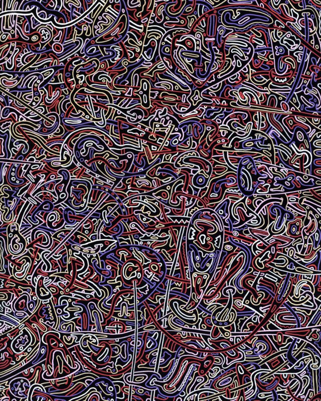
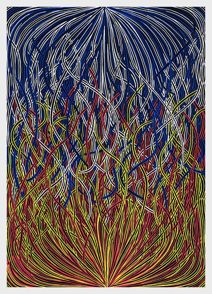
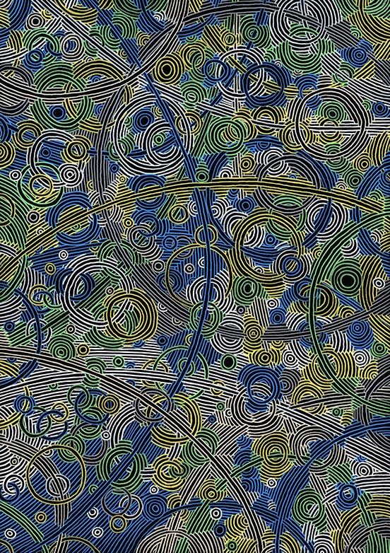
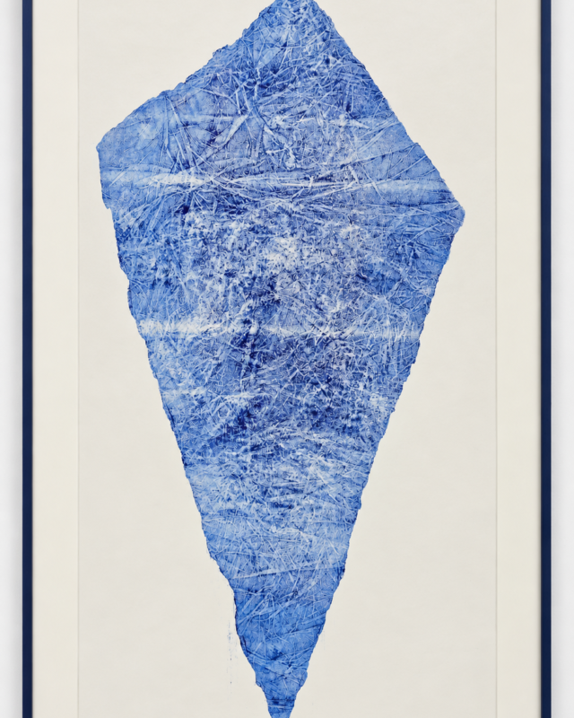
Alongside the maps I’ve been making abstract work for even longer. In 2014 I showed thirty-six small linocuts printed white on hand-torn black paper, and three large canvases I’d spent two months each drawing — thousands of overlapping ink lines, thinning out towards the middle to reveal a shape that was never actually drawn: a circle, a triangle, a rectangle. Since then I’ve filled an eighty-page sketchbook with red and black fine-liner drawings over the course of a year, and those have fed a series of one-metre canvases, five of them made for Thames Lido.
The idea underneath that work is close to Conway’s Game of Life: a simple starting point, repeated, producing something complex that looks planned but wasn’t. The maps work the same way. Both are slow and need patience, and both put me in the state I’m really after — absorbed in the making and out of my own head. Long carves are done to audiobooks. Most of Discworld and a good deal of Asimov went into Berlin. Otherwise it’s one song on repeat.
I was diagnosed with juvenile chronic rheumatoid arthritis at twelve, after about two years of hospital visits trying to work out what was wrong. It deformed my elbows and my right hand and badly restricted my range of motion. Treatment meant steroids, hydrotherapy and weekly blood tests to check the medication wasn’t damaging my liver. It went into remission when I was eighteen, but the damage stayed. I had a hip replacement last year and will most likely need the other one. When I’m carving I work through a fair amount of pain, and on the long pieces I’ve learnt to cut with my left hand as well as my right, and worked out a way of using both together. I’m also dyslexic.
Some of the work has taken me out of the studio and put me in front of people. I spent three months in a unit in the Oracle shopping centre, six days a week, showing the maps and running workshops so visitors could help print them. In 2017 I had a month in Düsseldorf, which came about through the anniversary of Reading’s twinning with the city — a Reading artist was invited over, with accommodation, a stipend, and one condition: the studio had to be open to the public for the open studio weekend. In 2019 the Musée de l’Imprimerie in Nantes flew me out for a week, where I gave a talk and made a piece for their collection; the exhibition carried on after I’d come home. I once sat in a café in Reading for a week drawing anyone who’d sit down, five minutes each, against a timer. None of these were things I went looking for; they were offered and I said yes. I like watching people react to the work in front of it, and I like drawing people in the room with me.
I’ve illustrated books and designed covers for the Emma Press since 2014. It’s work I enjoy for the way it pushes me into subjects and approaches I wouldn’t have chosen for myself. One of them, a collaboration with the poet Jacqueline Saphra that came out of life drawing, won a Saboteur Award for Best Collaborative Project.
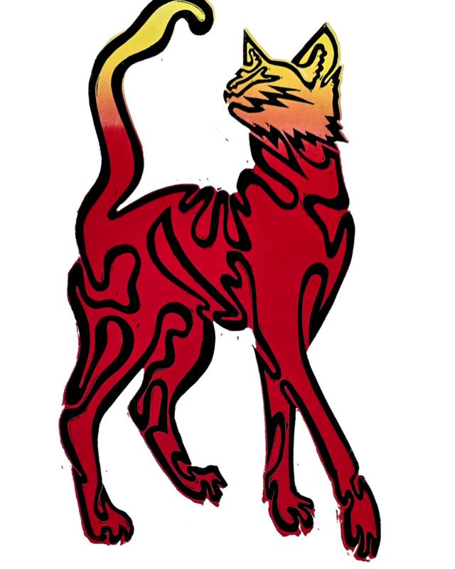
Other commissions have taken the work onto objects and covers. Ritzenhoff asked fifteen artists to design a milk glass, and I used the life drawing for mine — a nude figure seen from the front on the front of the glass, and seen from behind on the back, each drawn in a single unbroken line. Crafts magazine asked me to make the cover for the first issue of their redesign; the idea was that the covers should be made rather than laid out, so I carved the lettering, took the lino to London, inked it up there and had it photographed for the cover.
I work in a few places at the moment. I have a job as an art technician, which gives me access to some large Albion presses. I’ve recently taken a studio on Friar Street, in a former restaurant that the Reading Guild of Artists have taken over — my space is upstairs, next to the old bar. It’s empty at the moment; it’ll be large canvases, most likely abstract. Every Wednesday I run a life drawing group at the Print Club at Caversham Picture Framers, partly because I wanted to be drawing regularly again and running it means it actually happens.
I’m working on a map of Reading now, which is a different problem — I’ve lived here long enough that the difficulty isn’t the research but the choosing. I’m also about to start experimenting with turning linocuts into three-dimensional forms. I go back to Van Gogh’s letters often, and to Hockney, and to Picasso for the sheer range of what he was willing to try over a career. I make what I’m interested in making. The best work has always come from that rather than from anyone asking for it.