Maps
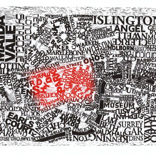
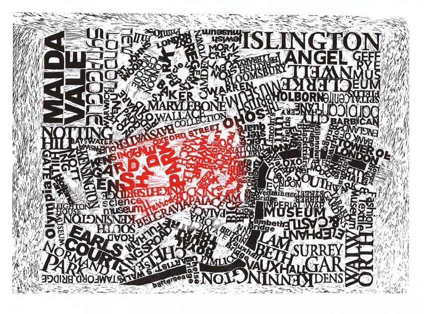 London
10 of 100 remaining
£500.00
London
10 of 100 remaining
£500.00
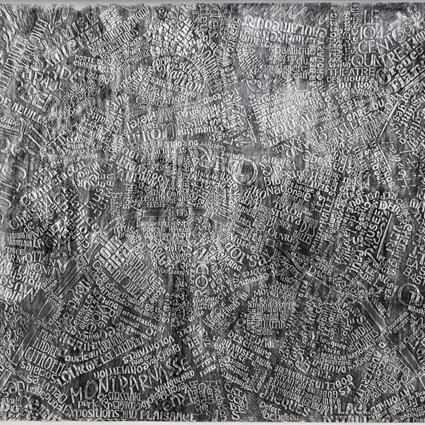
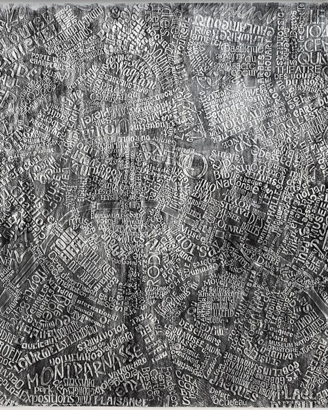 Paris - charcoal linocut
1 of 1 remaining
£3,000.00
Paris - charcoal linocut
1 of 1 remaining
£3,000.00
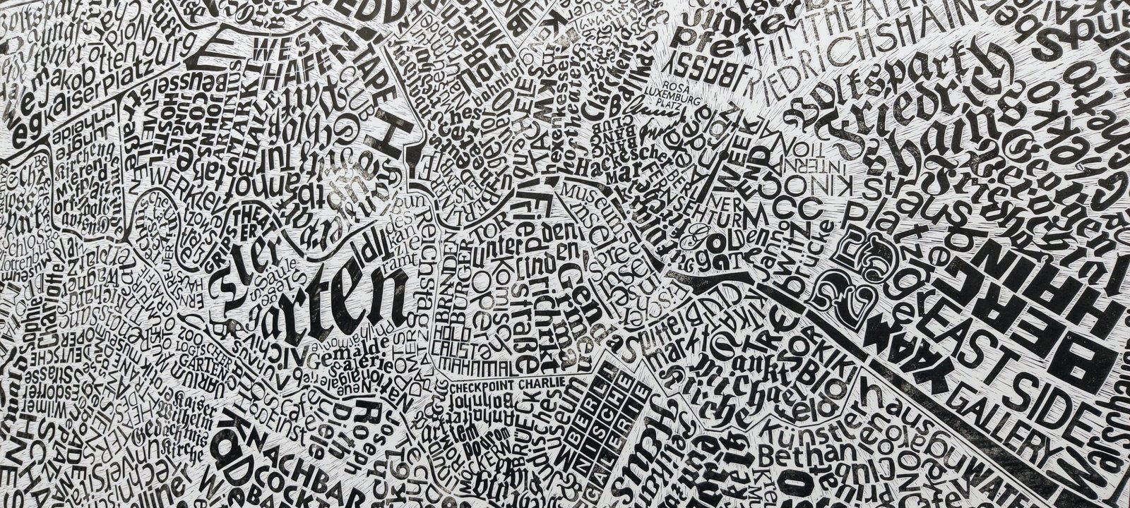 Berlin
1 of 12 remaining
£2,500.00
Berlin
1 of 12 remaining
£2,500.00
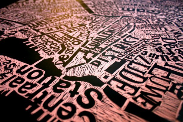
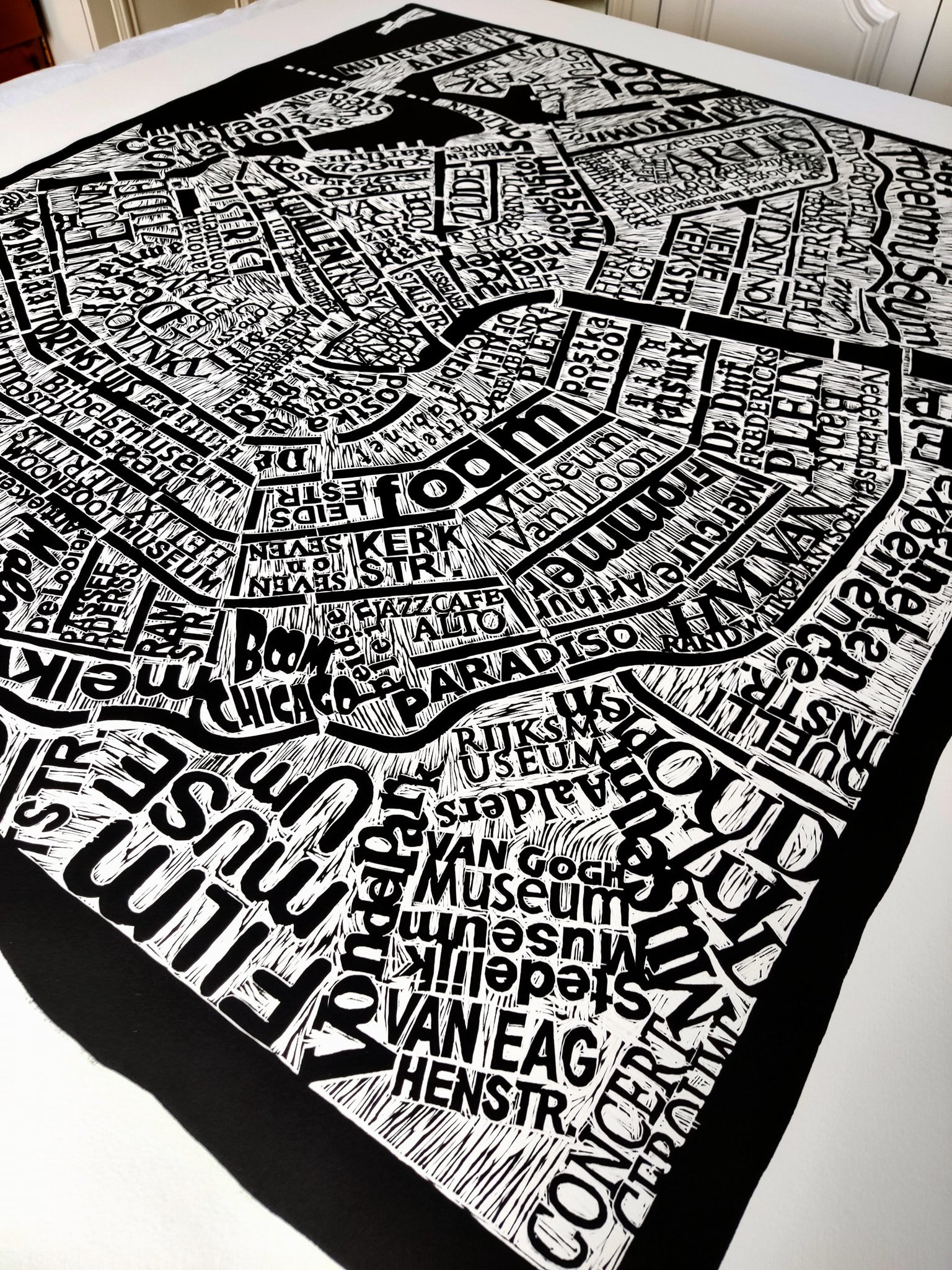
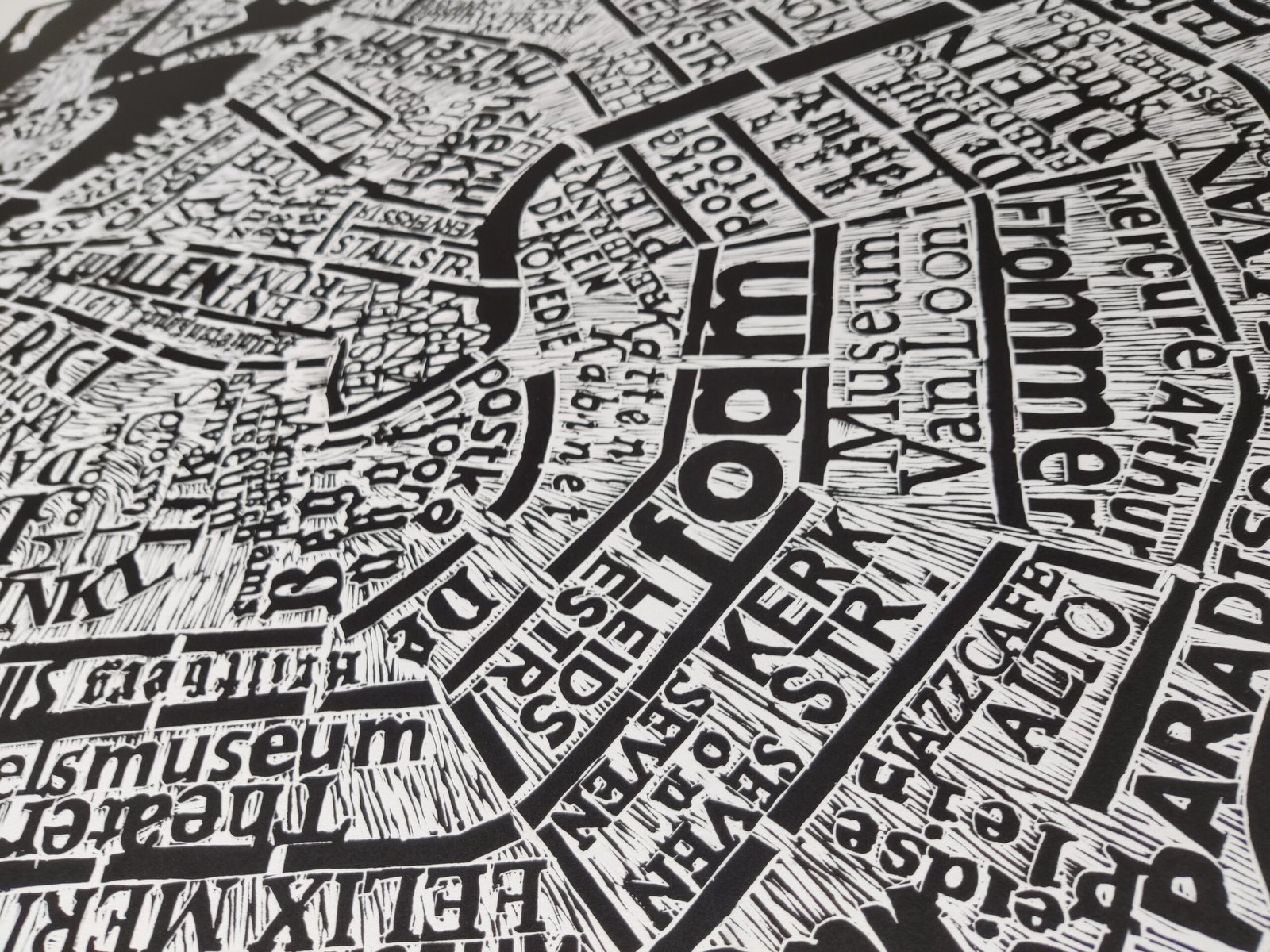
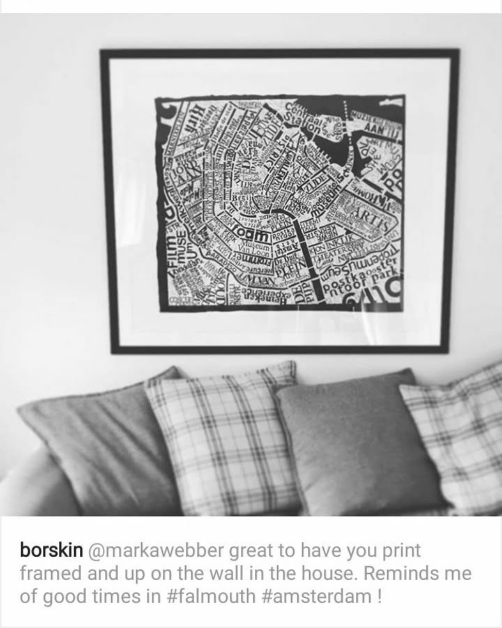
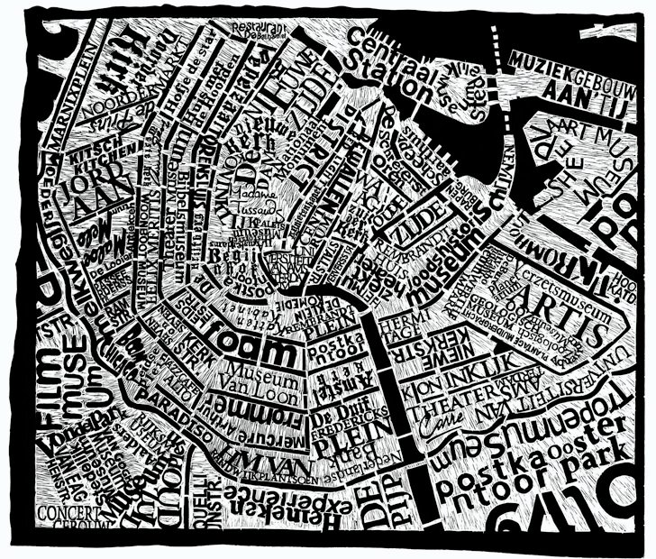 Amsterdam
100 of 300 remaining
£300.00
Amsterdam
100 of 300 remaining
£300.00
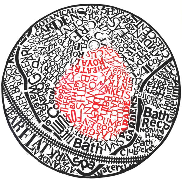
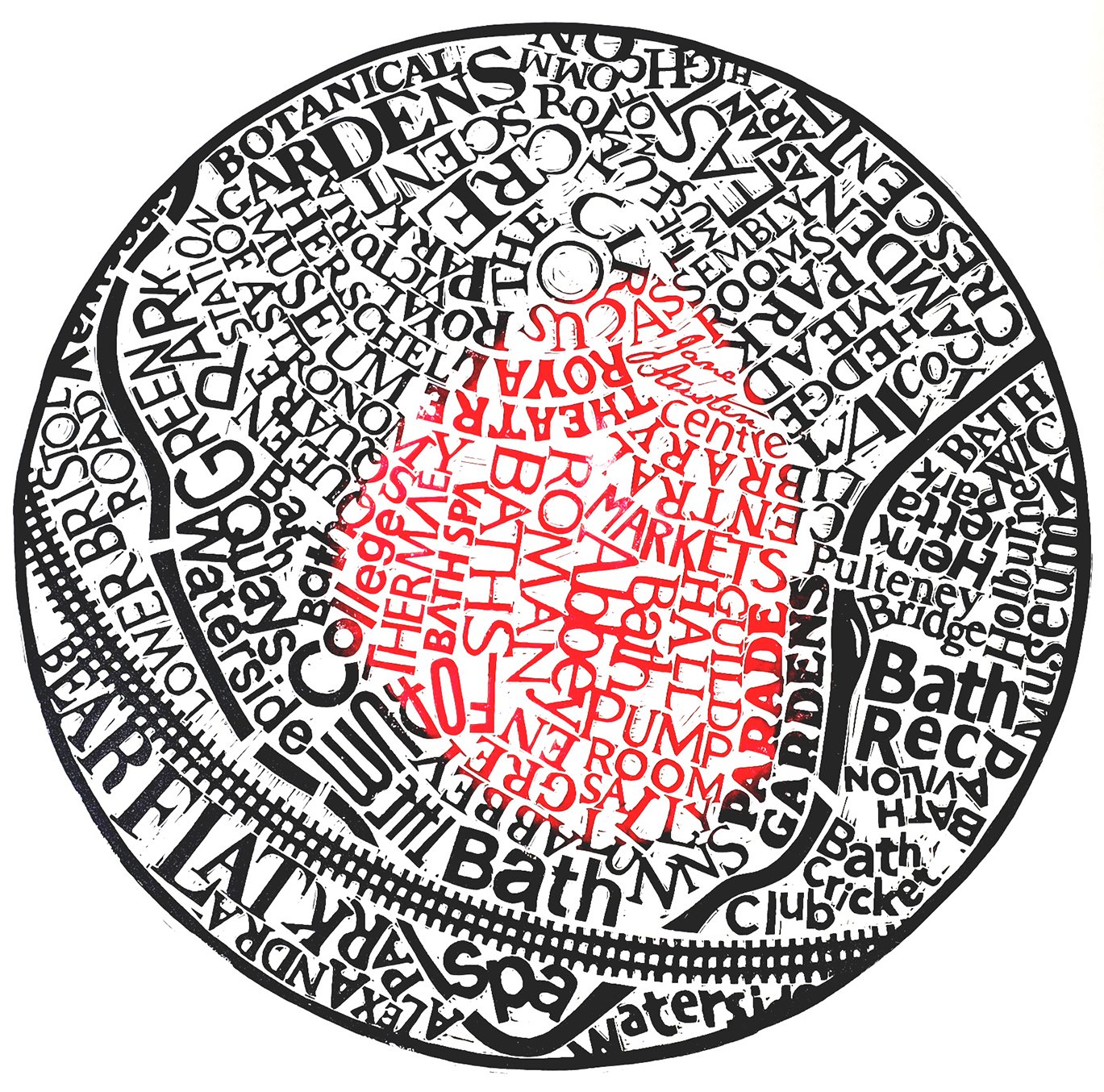 Bath
5 of 100 remaining
£250.00
Bath
5 of 100 remaining
£250.00
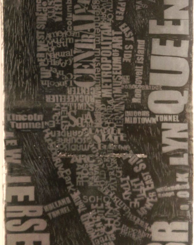 New York Ghost
Edition of 1
£1,200.00
New York Ghost
Edition of 1
£1,200.00
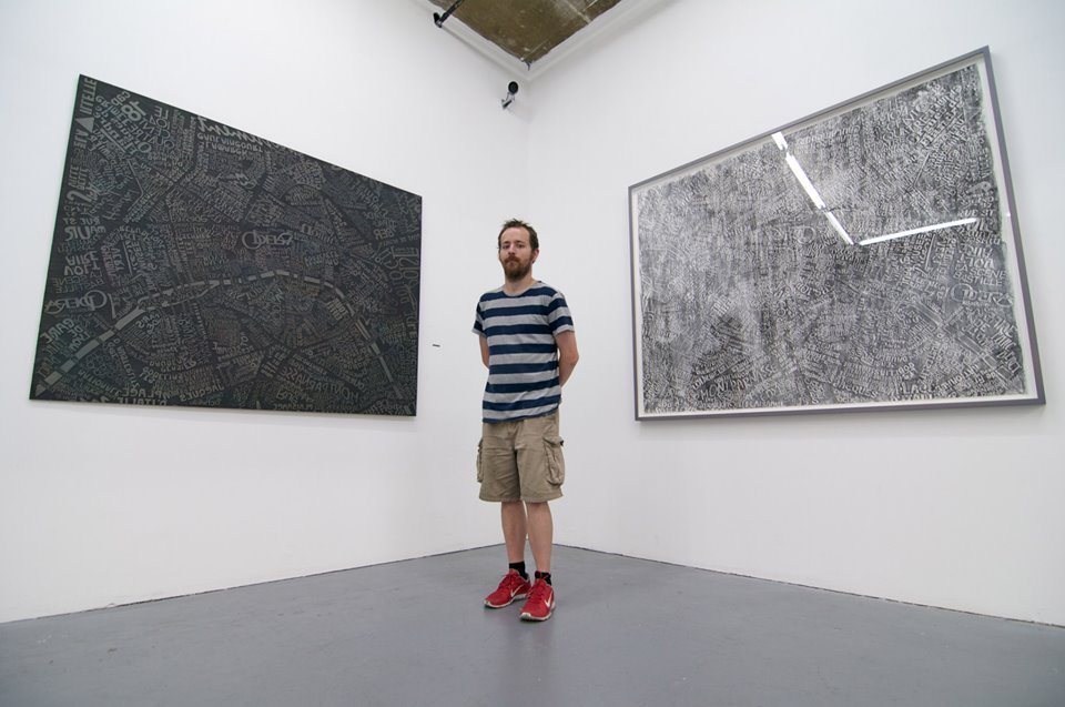 Reading
Pre-release list open
Reading
Pre-release list open
London
10 of 100 remaining
£500.00
Paris - charcoal linocut
1 of 1 remaining
£3,000.00
Berlin
1 of 12 remaining
£2,500.00
Amsterdam
100 of 300 remaining
£300.00
Bath
5 of 100 remaining
£250.00
New York Ghost
Edition of 1
£1,200.00
Reading
Pre-release list open
Signed and numbered · Printed by hand · Free UK delivery
See all maps →
Abstracts
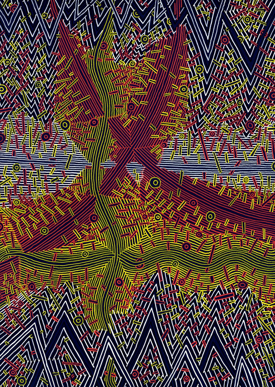 Energetic
Edition of 1
£300.00
Energetic
Edition of 1
£300.00
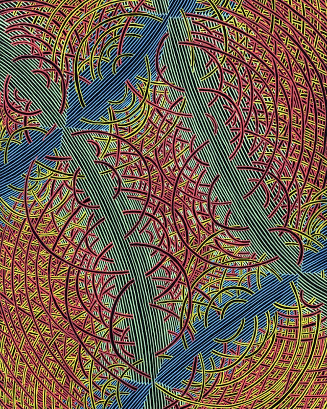 Chaos Waves
Edition of 1
£300.00
Chaos Waves
Edition of 1
£300.00
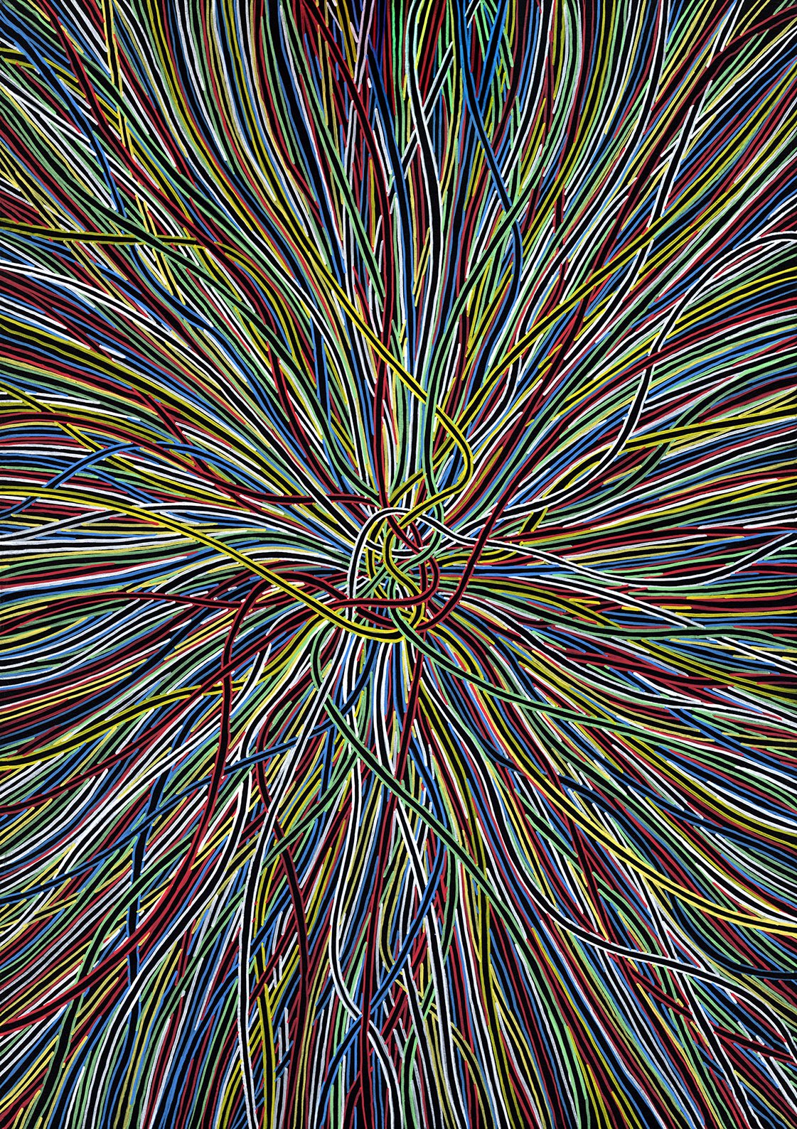 Knotted
Edition of 1
£300.00
Knotted
Edition of 1
£300.00
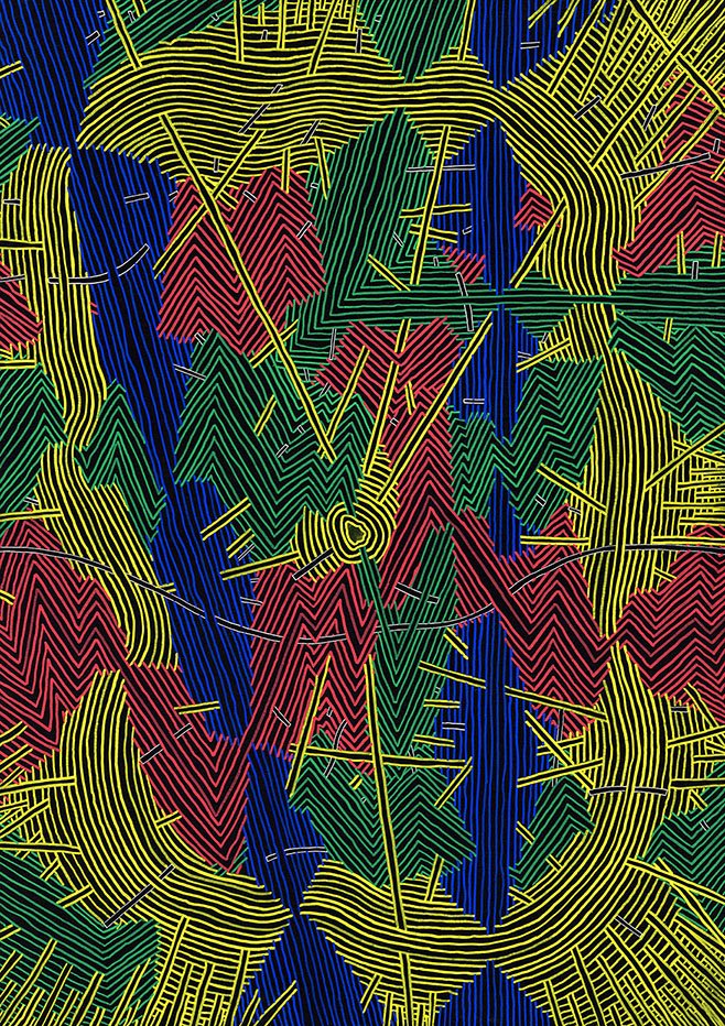 Scouting
Edition of 1
£300.00
Scouting
Edition of 1
£300.00
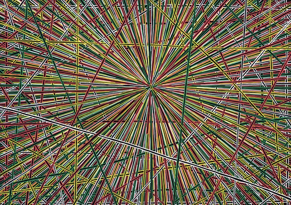 Beginning
Edition of 1
£300.00
Beginning
Edition of 1
£300.00
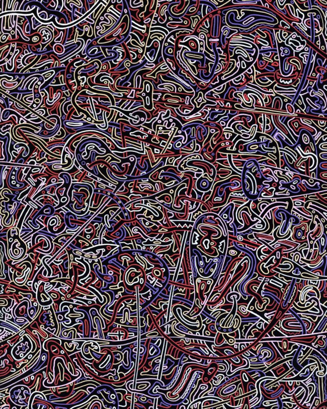 Basking
Edition of 1 · Sold out
Basking
Edition of 1 · Sold out
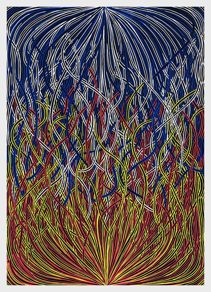 Hot and Cold
Edition of 1 · Sold out
Hot and Cold
Edition of 1 · Sold out
Energetic
Edition of 1
£300.00
Chaos Waves
Edition of 1
£300.00
Knotted
Edition of 1
£300.00
Scouting
Edition of 1
£300.00
Beginning
Edition of 1
£300.00
Basking
Edition of 1 · Sold out
Hot and Cold
Edition of 1 · Sold out
Canvases, line drawings and mixed media from the studio
See all abstracts →
Studio Prints
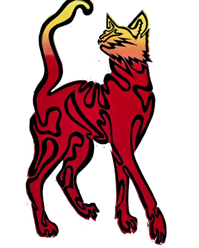
Smaller linocuts, oddments and one-offs
See all studio prints →