About the Maps
The Typographic Origin: “Where in the World”
This series began at Reading College during my graphic design studies, sparked by a brief for the International Society of Typographic Designers titled “Where in the World.” Having spent the previous summer in New York, I wanted to capture the sensory overload of the city—the way the architecture and the energy felt as a visitor.
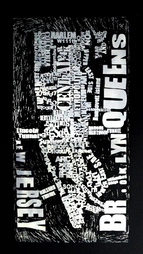
I created a large-scale linocut map of New York using nothing but typography. By varying the sizes and directions of the type, I replicated the disorientation and vibrance of the streets. That project set the foundation for everything that followed. When I was later asked to create a map of London for the London Design Festival, a one-off college project evolved into a lifelong series.
Expansion and the Viral Pivot
After London, I worked on Amsterdam, but it was with Paris that I decided to push into an entirely new scale. The process was raw and domestic; I spent two months carving the Paris map while laying on my bedroom floor, navigating the massive sheet of linoleum in a cramped space.
This map marked a turning point in my career. It gained significant recognition and went somewhat viral following a feature on a Creative Review blog titled “Man seeks massive printer.” I was hunting for a way to actually produce these oversized works, and the search led me to Thumbprint Editions in London. It was there that I finally managed to create professional prints of the London and Paris maps, as well as a series of experimental monoprints for the original New York block.
The Evolution of Scale and Resilience
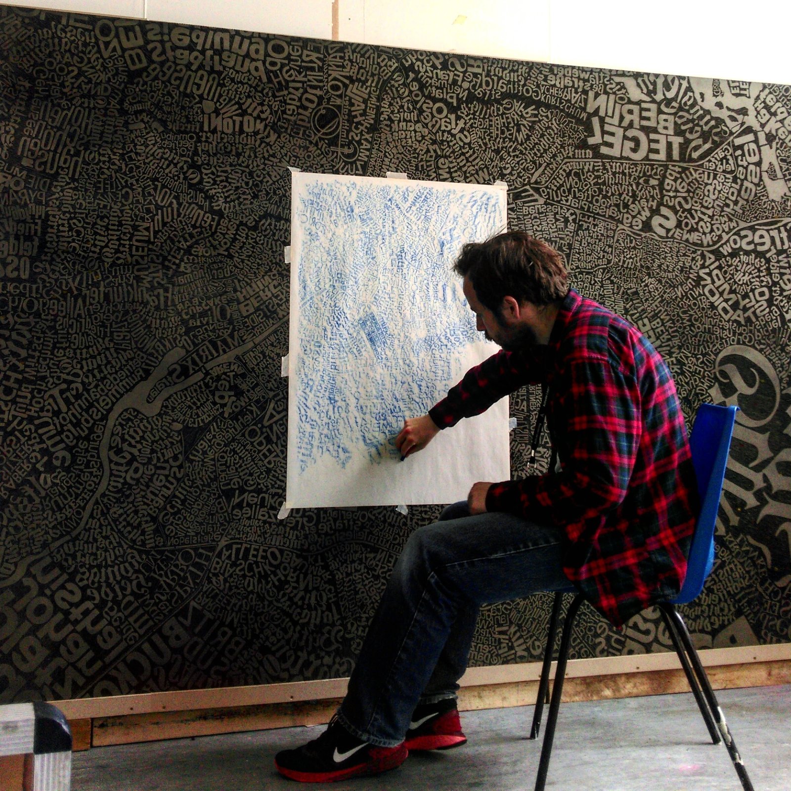
As the series progressed, the reasoning behind it deepened. This culminated in the Berlin map—a 2.4-meter block that became a defining test of my physical and mental limits. I put roughly 2,500 hours into the manual carving of that block, documenting the slow, rhythmic evolution in a timelapse.
Having lived with chronic arthritis since I was 12, the physical act of relief printing is a double-edged sword. It is demanding and often painful, but seeing a project of that magnitude through to the end is a vital act of will. During the carving of Berlin, I actually had to teach myself to carve using both my left and right hands. This allowed me to continue working on particularly painful days, giving one hand a rest while the other took over the gouge. It proved I could navigate my own physical limitations by literally changing the way I worked to keep the momentum going.
From Solitary Work to Public Connection
The culmination of the Berlin project was my first solo show, where 500 people turned up for the private view. After so many thousands of hours spent alone with the lino, it was incredible to bring people into that process.
For the event, I hosted a public printing where the audience became part of the creation. Because of the scale, we didn’t use a traditional press; instead, people helped me print the work using large spoons, hand-burnishing the paper against the inked lino. It turned what is usually a solitary practice into a collective, high-energy event.
Typography as Geography
My maps aren’t just about location; they are about how a city speaks.
- The Visual Language: I don’t just label streets; I let the letters become the streets. For Berlin, I integrated hundreds of unique typefaces found within the city itself, ensuring the map was built from its own distinct visual DNA.
- The Edit and “White Space”: I prioritize areas of visual interest over total geographic accuracy. The use of “white space” is a deliberate compositional choice to allow the work to breathe, but these uncarved areas also define the physical shapes of roads and urban voids.
The Laboratory of the Press: Experimental Monoprints
Once the carving is complete, the block becomes a tool for deep experimentation. I don’t see the linocut as a static end-point; instead, I treat the printing process like a laboratory.
I’ve moved beyond traditional inks to incorporate a wide range of mediums—spray paint, acrylics, and drawing inks—to produce unexpected and interesting effects. This stage of the work is quite experimental and highly personal. By manipulating these different mediums on the block, I can create stylized versions of the maps that feel fluid and expressive, moving beyond the rigid lines of the carved lino into something more atmospheric and unique.
Coming Home
After completing Berlin, I realized I didn’t have to keep going “up” in scale to find meaning. I shifted my focus to the intimacy of smaller locations, like Bath, and I am currently working on a map of my home town, Reading. It feels like a full circle—bringing the techniques, the typographic philosophy, and the resilience I’ve developed over years of international maps back to the place where it all began at college. These maps are a record of my persistence—not just in art, but in navigating the world with the hands I have.